Ascension Press: Logo and Email
Ascension Press is a leading Catholic publishing and media organization serving thousands of Christians worldwide through faith-formation services and products. Below is a redesign of Ascension's logo and email template.
Ascension logo redesign
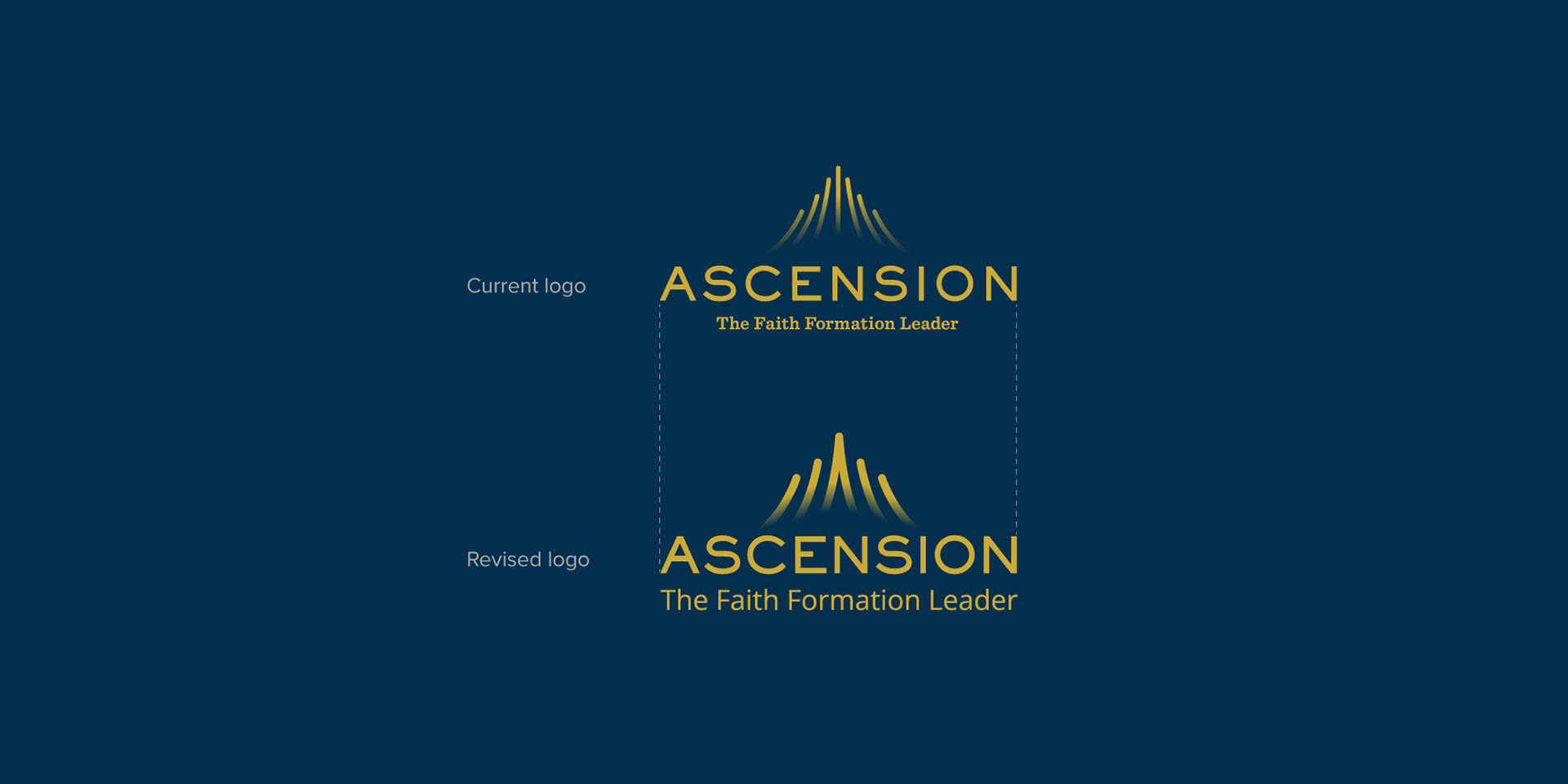
The current logomark for Ascension Press are seven curved lines ascending from bottom to top representing Christ's ascension into heaven. The logomark is clever and easily recognizable to Christians, however it could use some improvements.
Current logo

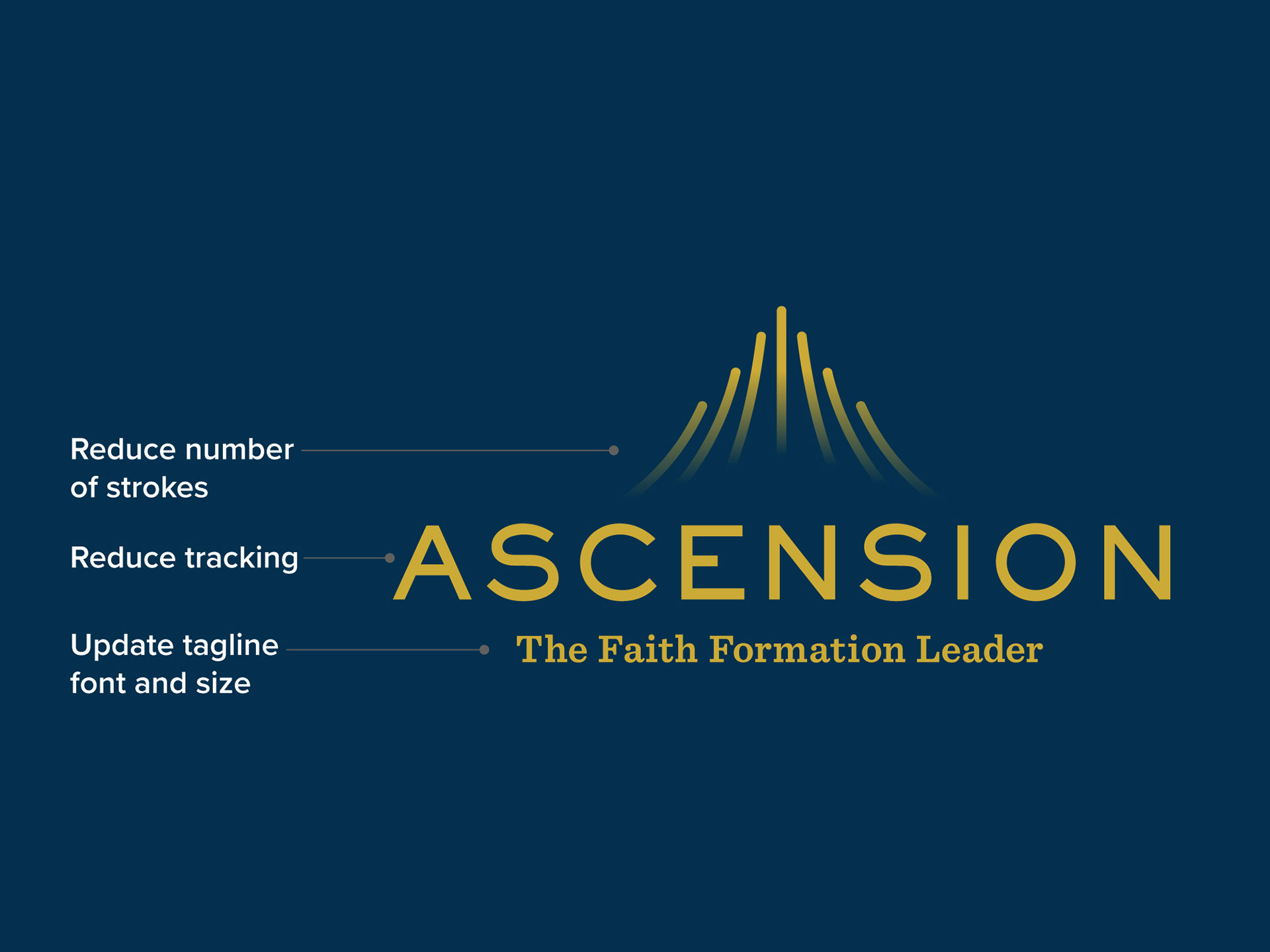
Suggested changes
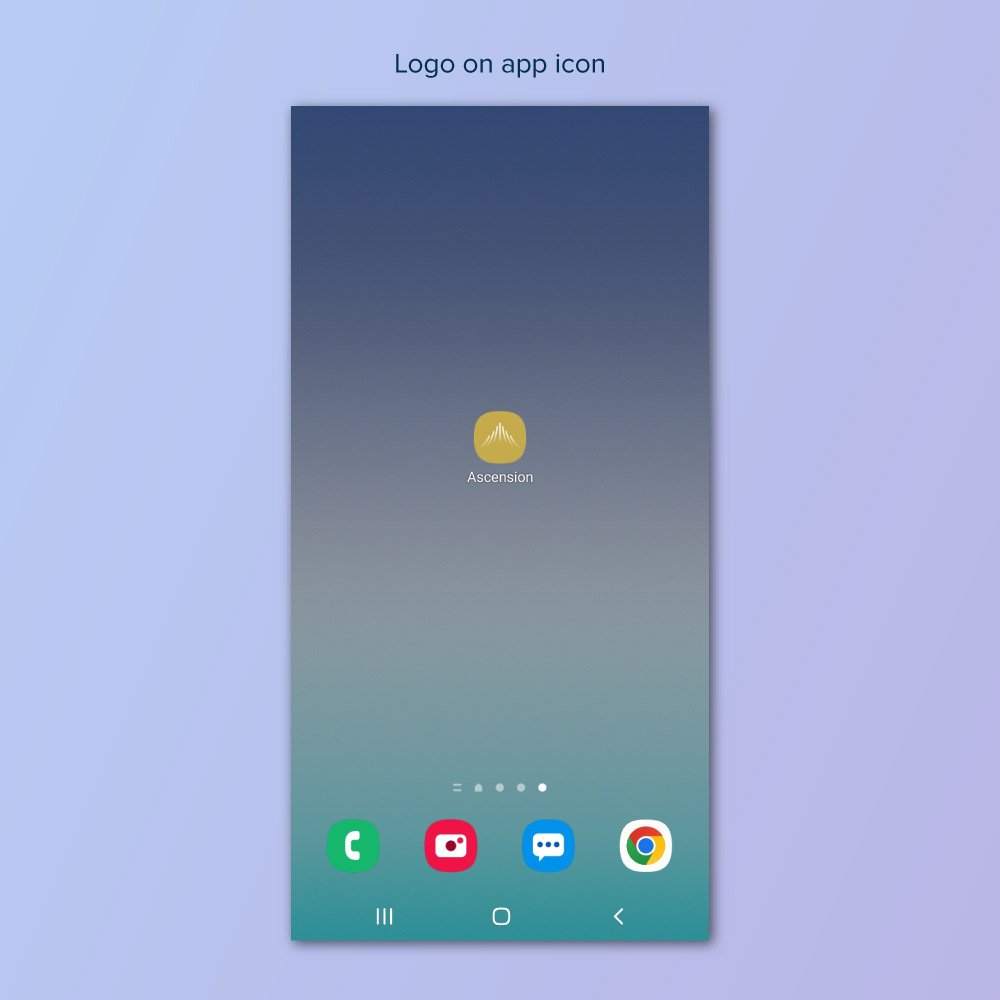
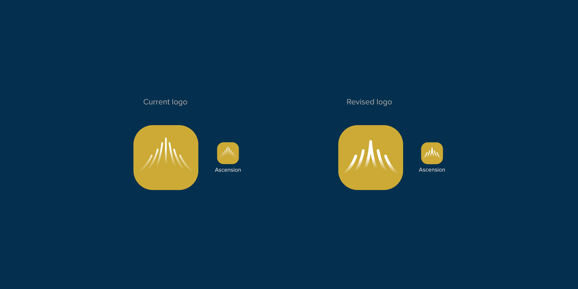
1. Reduce the number of strokes in logomark: Less strokes will allow for more space to use thicker strokes instead. This will help logo recognition when scaled down as seen on the revised logo used on the app icon. An even number of strokes also allow for the two center strokes to unite and create an abstract "A" which also helps in unifying the logomark.
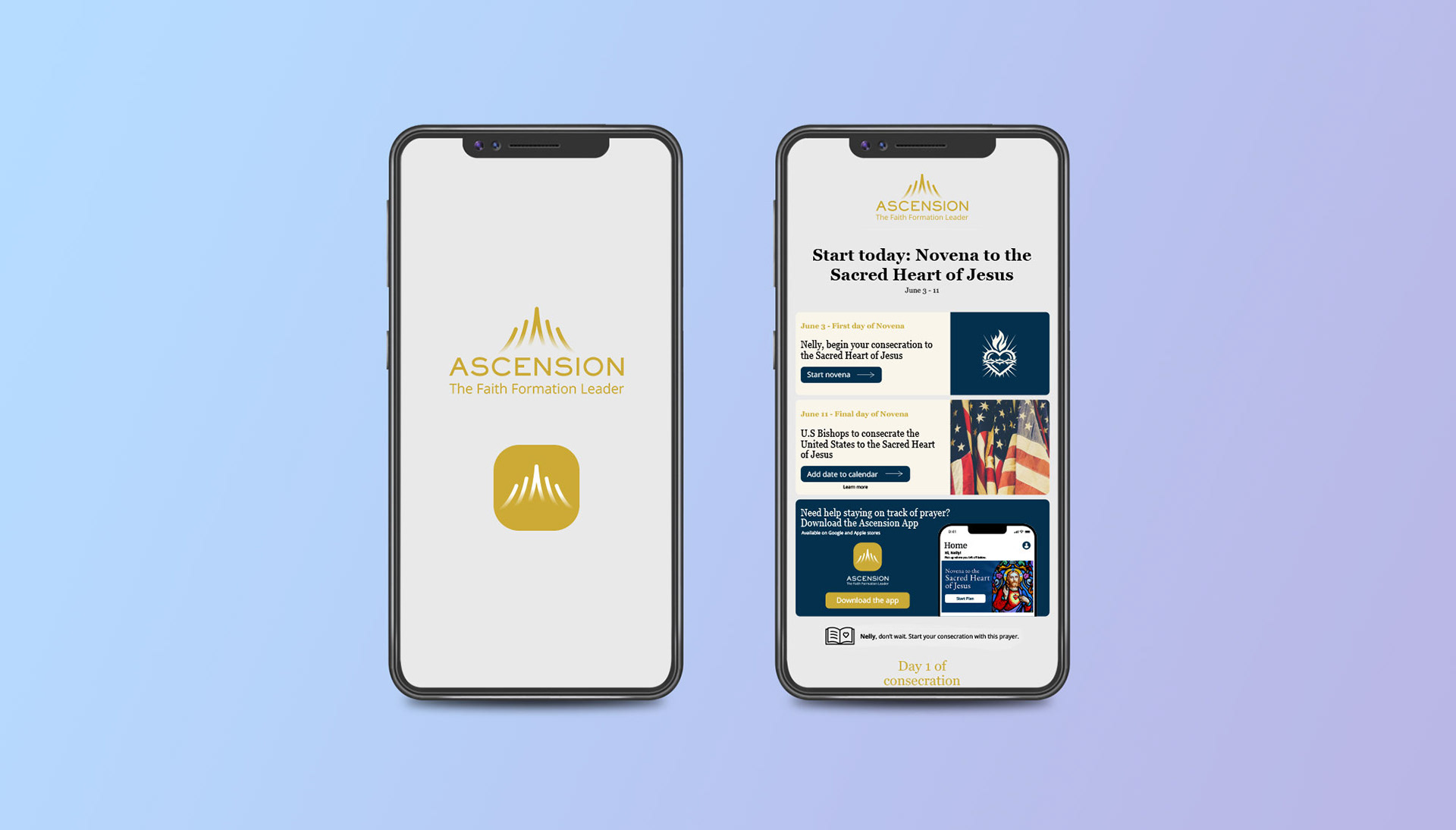
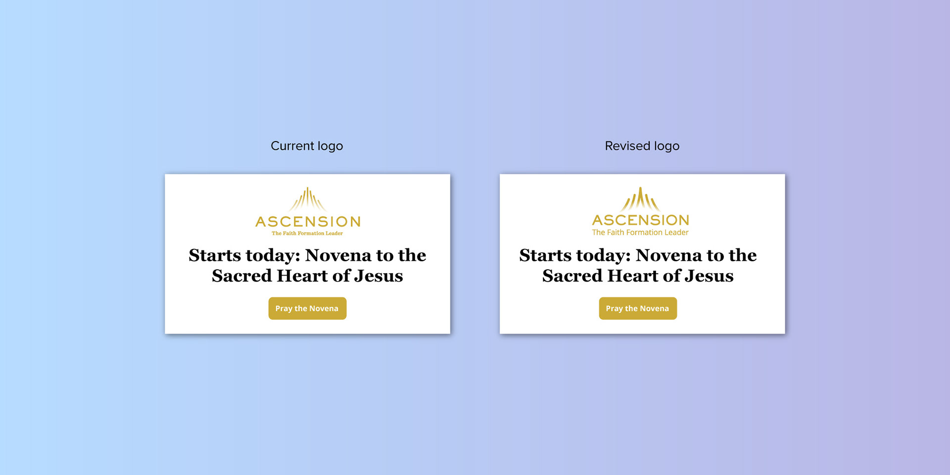
2. Reduce tracking in wordmark: By reducing tracking in "ASCENSION", the wordmark becomes narrower, takes up less horizontal space and thus can be larger and more legible when applied on smaller spaces such as email headers or footers.
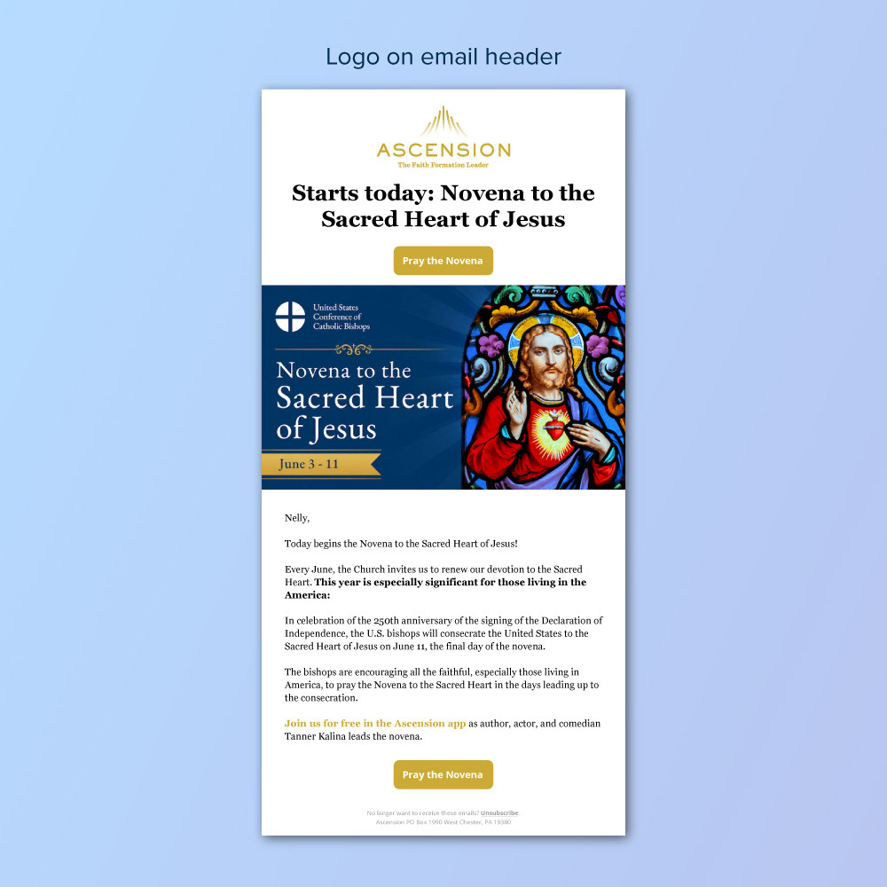
3. Update font and size in tagline: Tagline easily gets lost when scaled down as seen above in the email header, specially if using a light color and a serif font.
Recommended logo updates include keeping the fonts in the Ascension logo the same as the ones used on web and print materials.
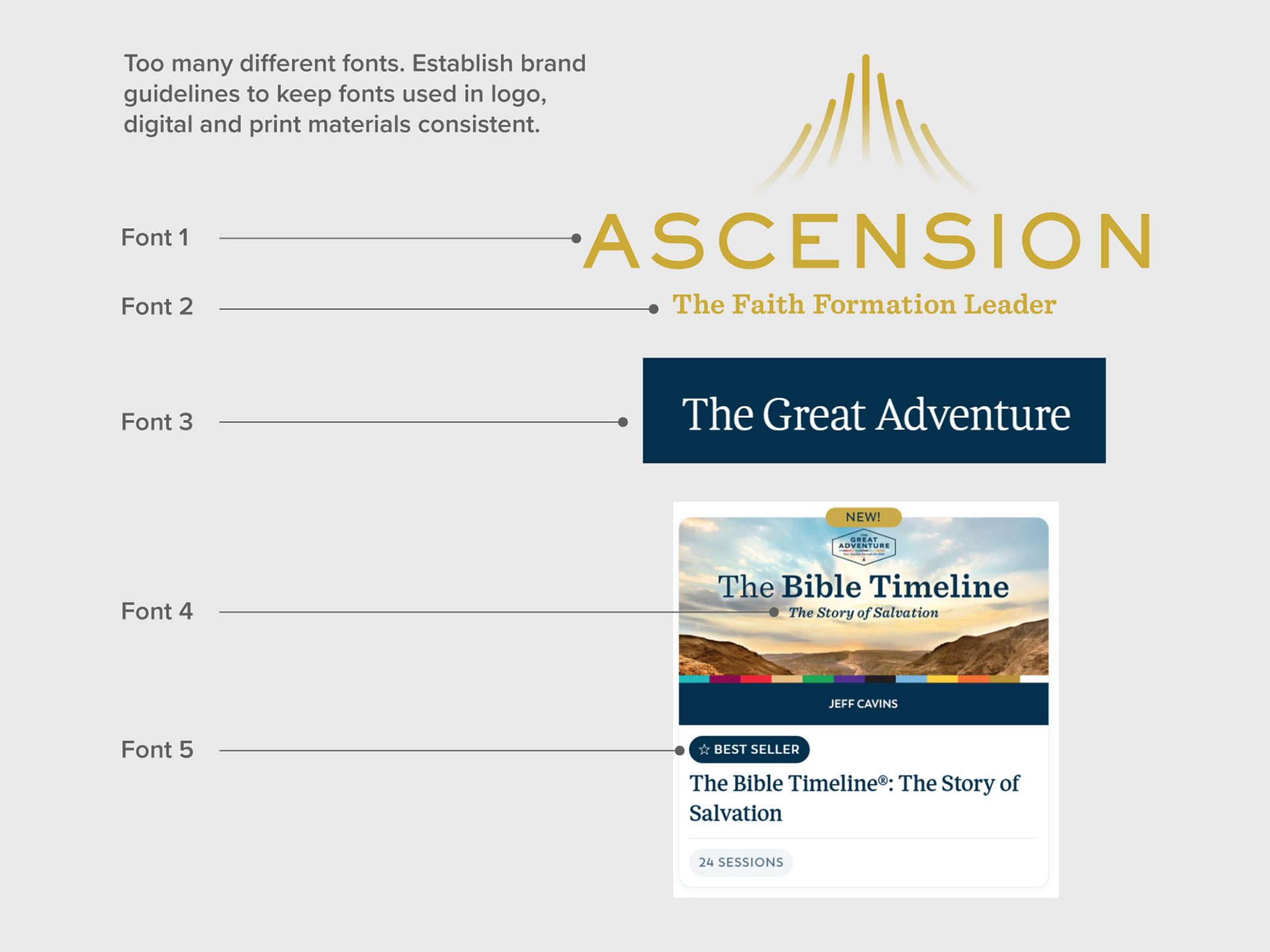
Keep fonts to a minimum. Font excerpts were taken from "The Great Adventure" series under "Programs".
Revised logo
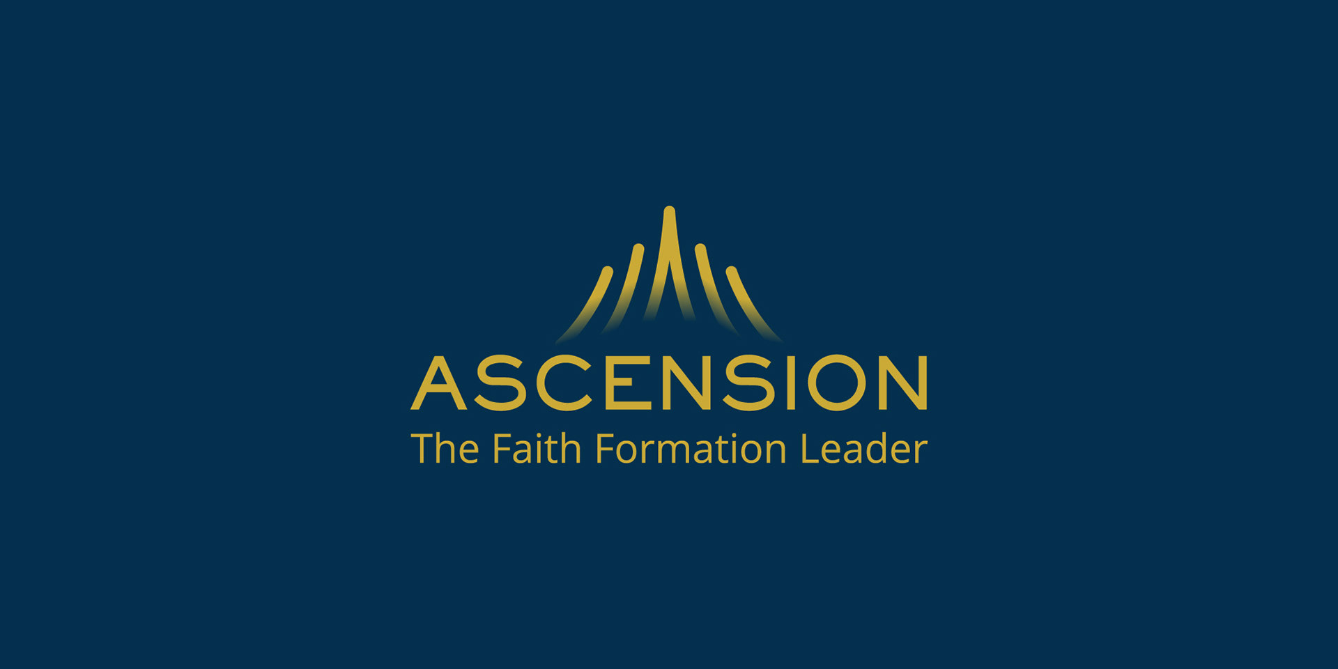
Logo comparison: current vs new
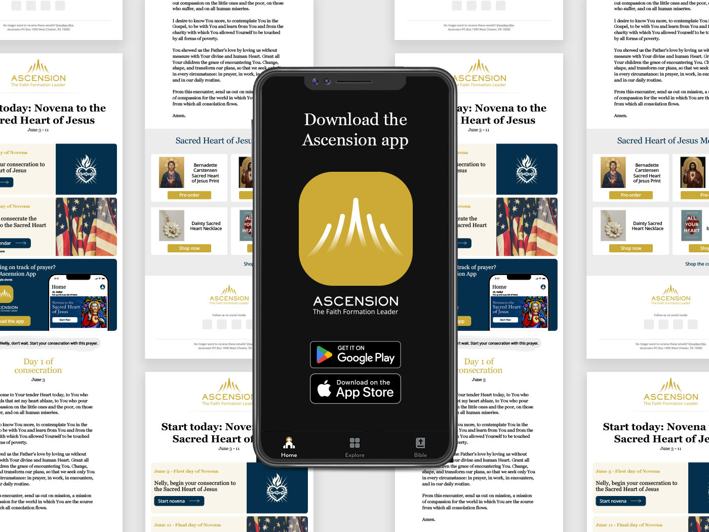
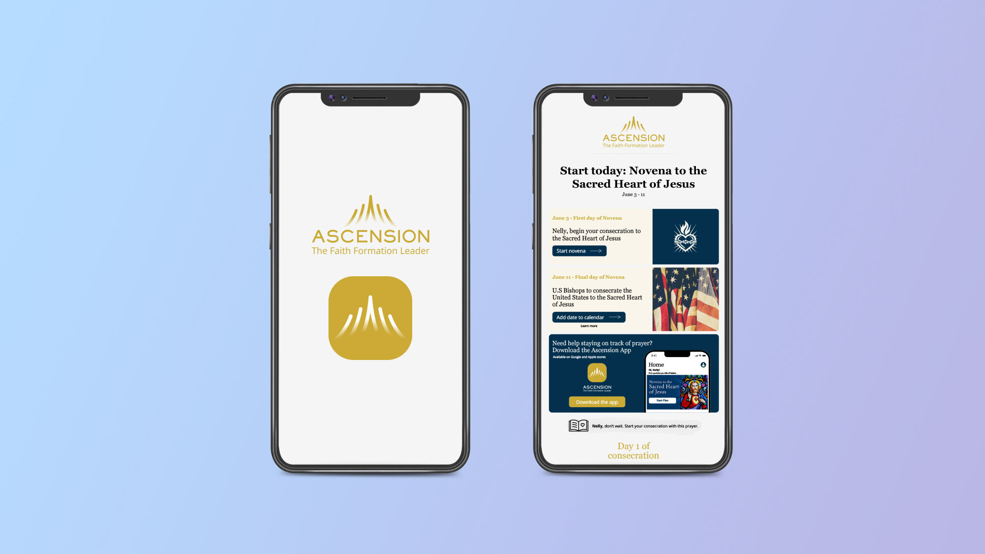
Logo on email header
Logo on app icon
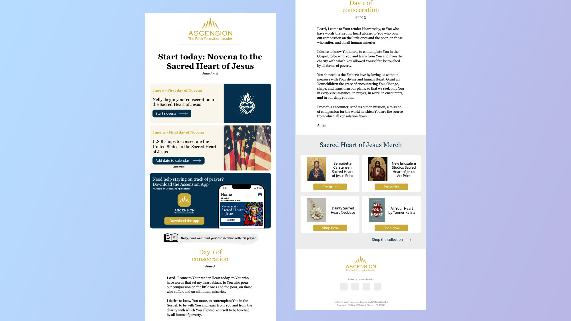
Ascension email redesign
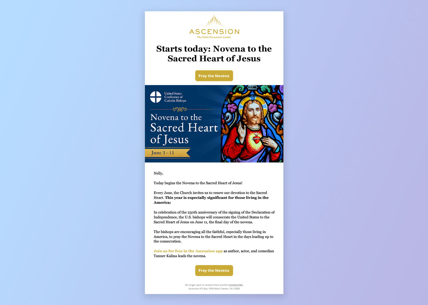
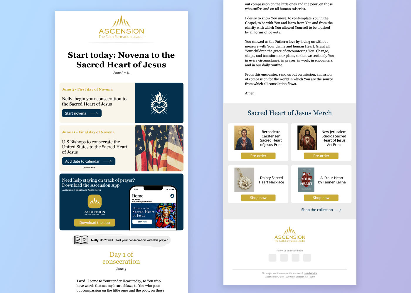
Below is a redesign of one of Ascension's emails titled "Novena to the Sacred Heart of Jesus". The email has been redesigned with user experience in mind. Here are some ways to improve user experience when reading emails.
1. Avoid large bodies of copy: Users have little time and interest in reading large bodies of copy unless they are reading for pleasure.
2. Summarize information: Email content should be easy to navigate and digest. A simple way to deliver information is by breaking down email content into groups, categories and sections. Break down email content and summarize it, this will help users quickly find information, understand the topic, stay engaged and take action.
3. Highlight important information: Users will spend seconds glancing through an email. For marketing to work properly, important information needs to be emphasized and be straight to the point. Information can be emphasized by using large titles, color and imagery but should also be enticing and connect with the user.
Current email
New email redesign
Thank you for reading.