UPLIFT Desk Home Page Redesign
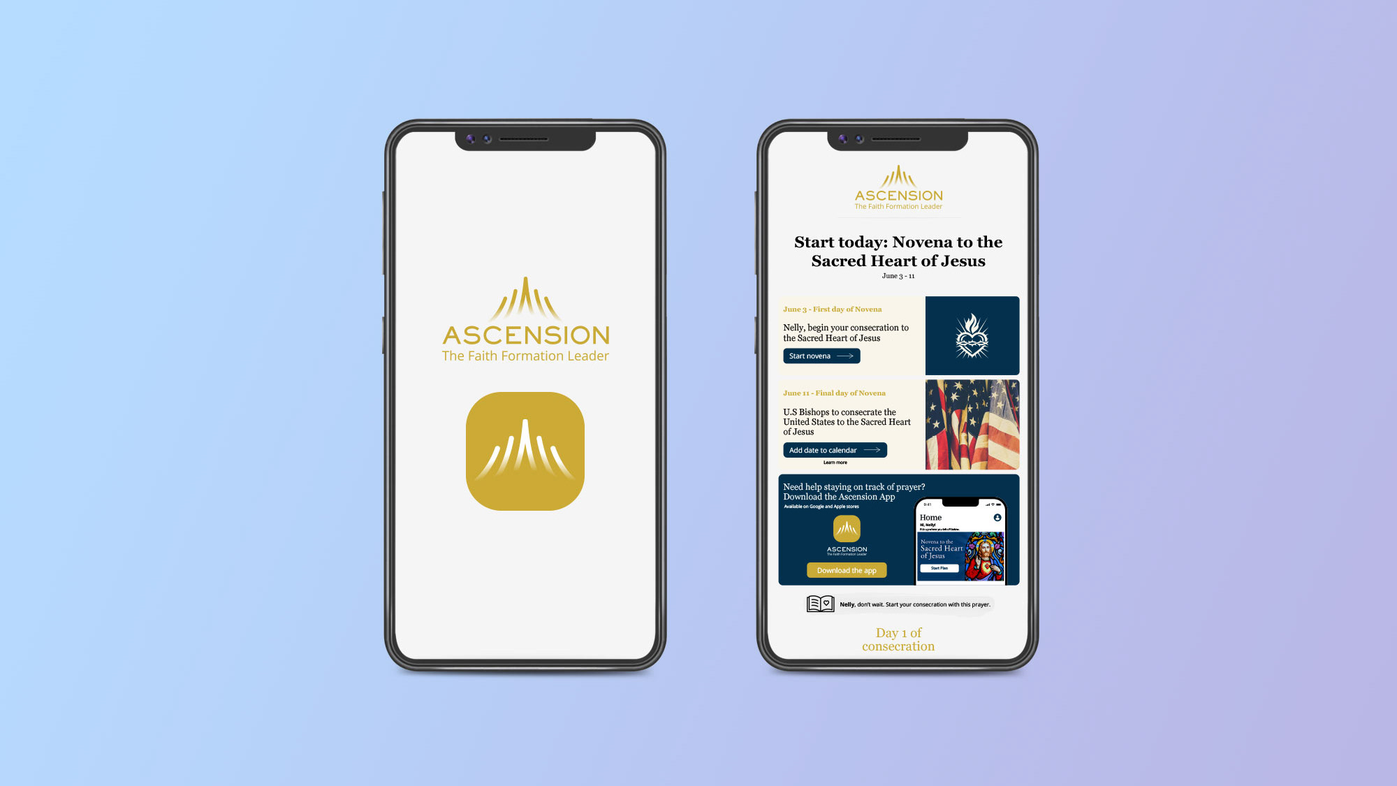
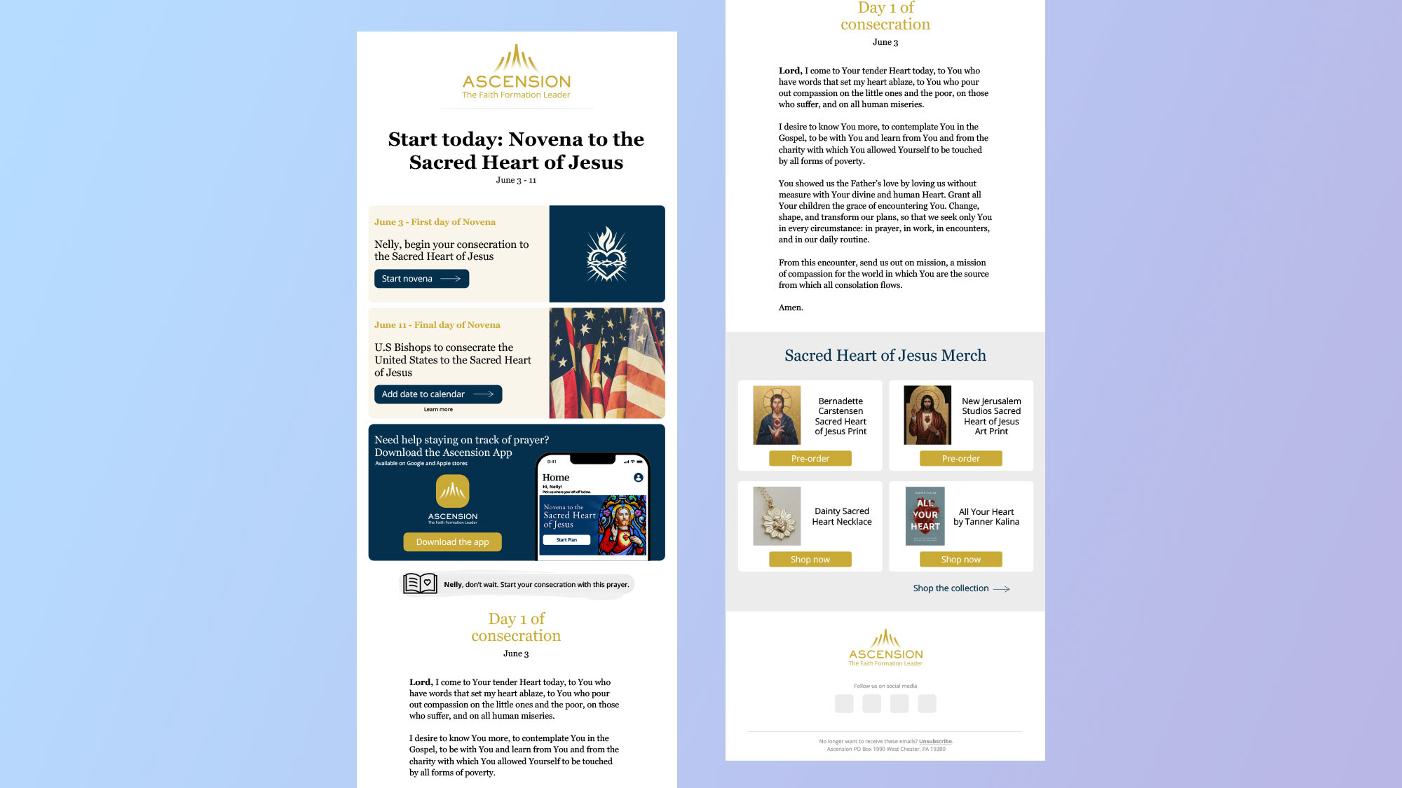
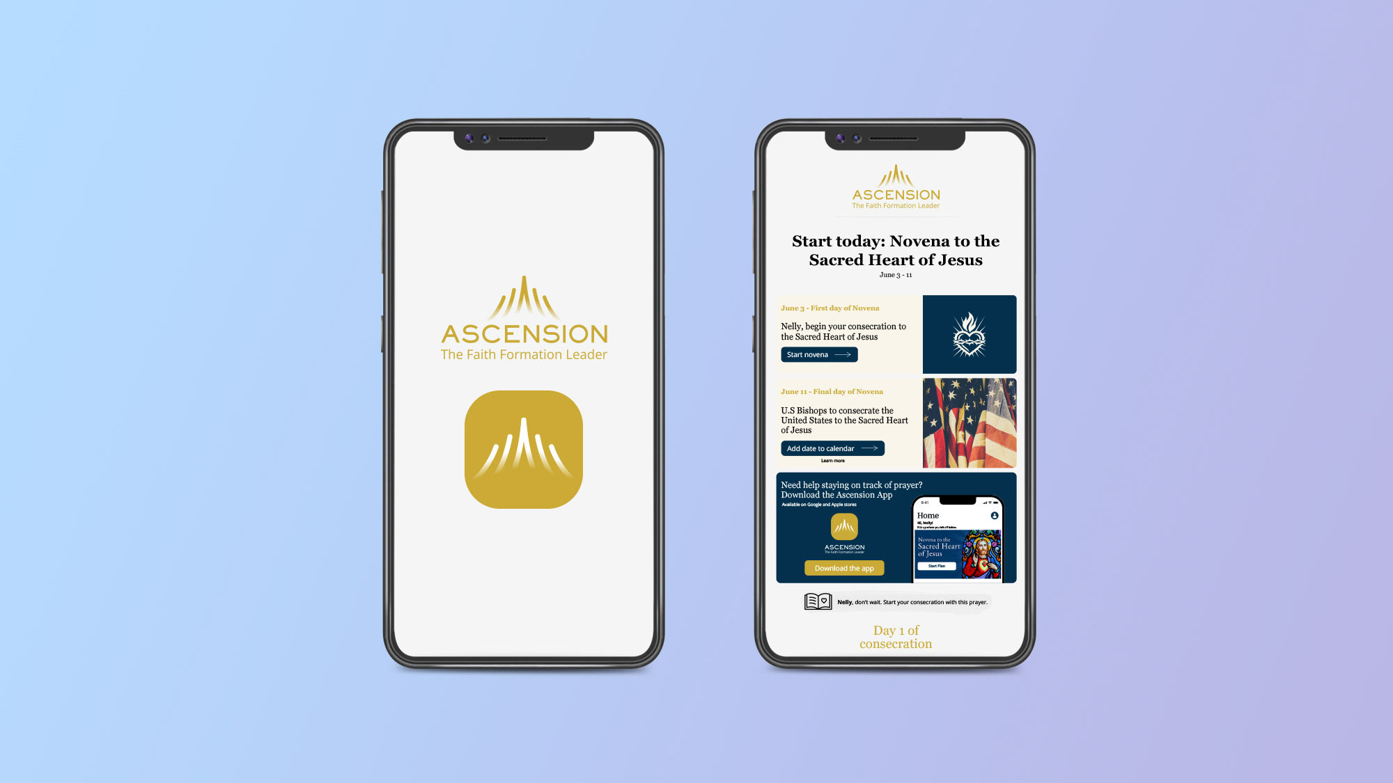
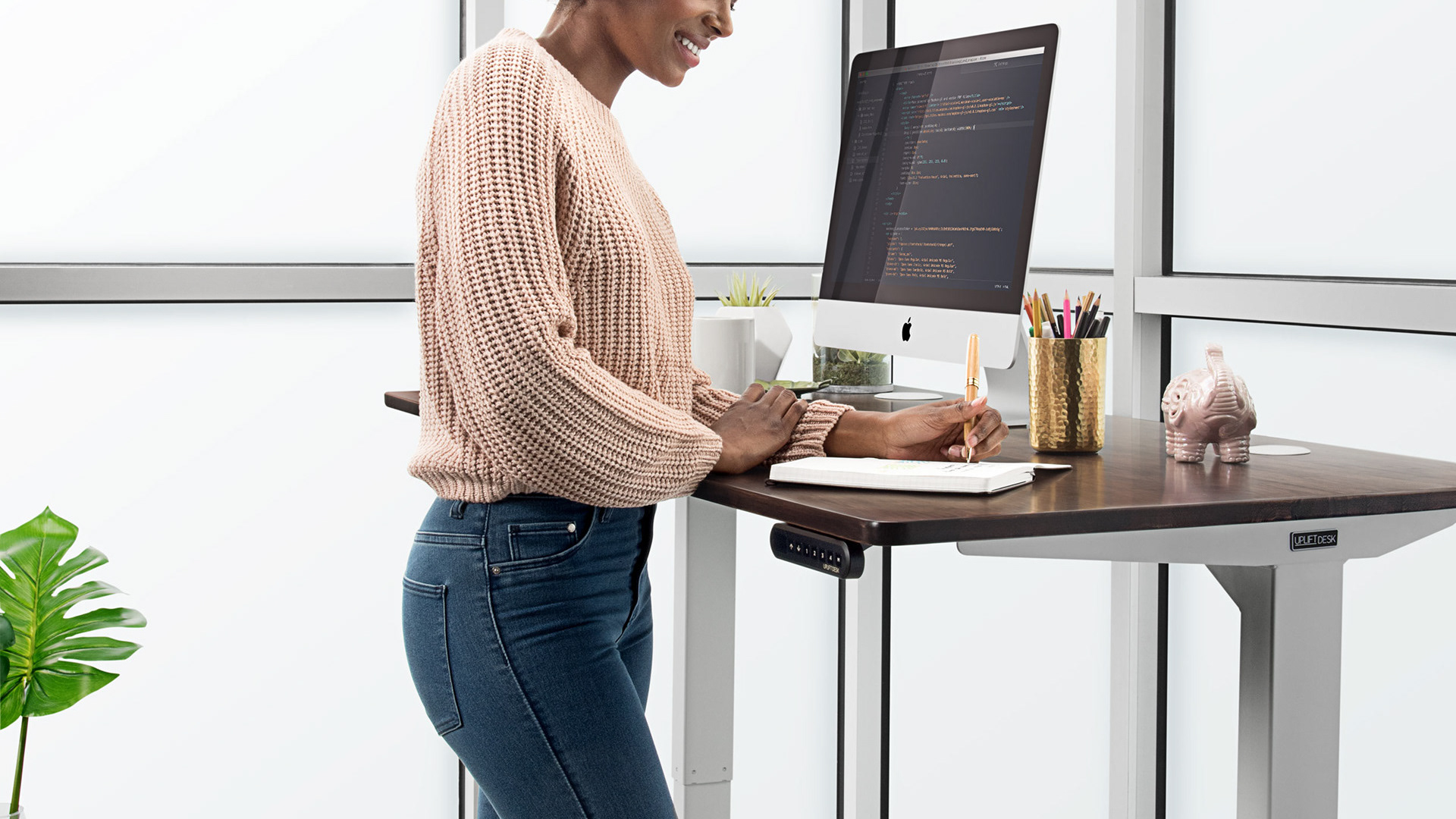
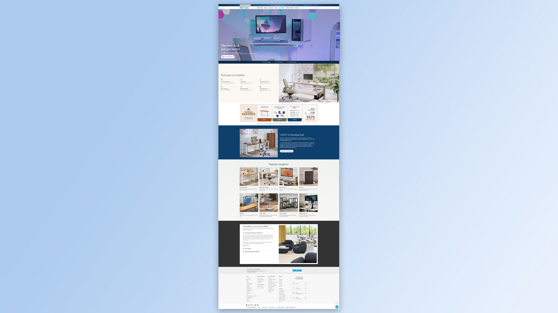
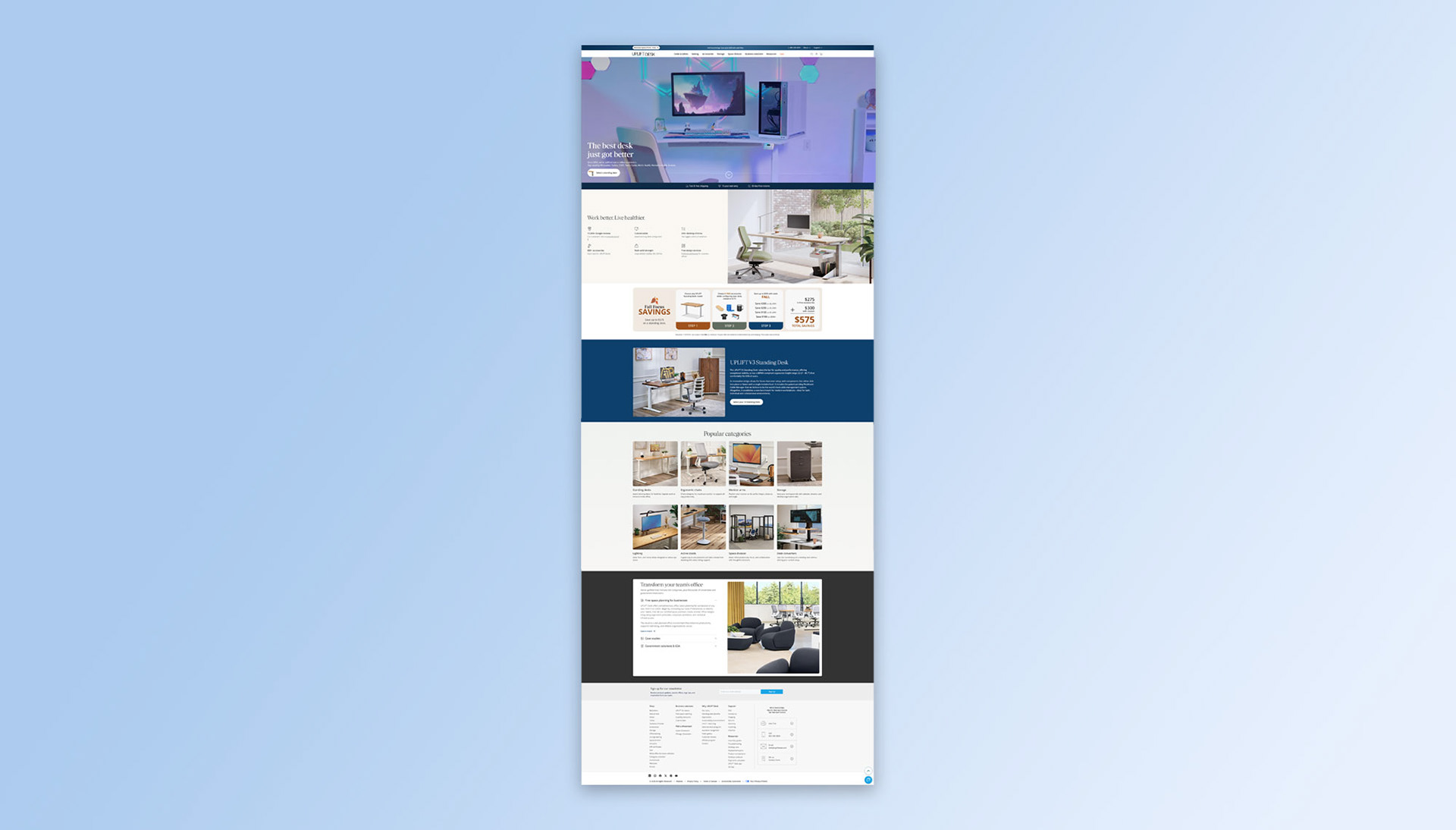
UPLIFT Desk launched the V3 Standing Desk, an improvement over the V2 Standing Desk at the end of 2025. However, the marketing team failed to properly market and announce the V3 Standing Desk. Not seeing the V3 Standing Desk properly marketed, prompted me to notify the owner and suggest some changes. Below is the UPLIFT Desk home page redesigned based on some feedback provided.
Suggested updates
The marketing team at UPLIFT Desk built a dedicated landing page for the newly launched V3 Standing Desk. This page was hard to find, it was initially only accessible under the drop down menu "Desks & Tables". The marketing team already had the marketing material to successfully promote the V3 Standing Desk. I asked them to repurpose the content and layout found on the V3 Standing Desk landing page and implement it to the home page. Below is a quick overview of these updates.
Implemented updates
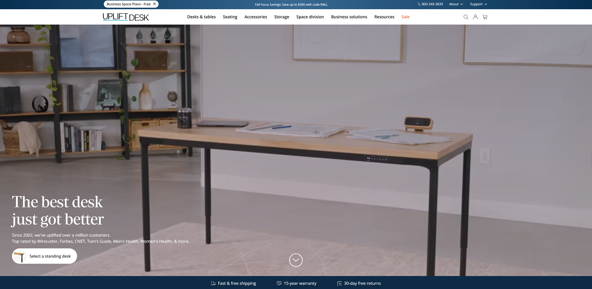
1. Hero video updated
The marketing team produced an excellent demo video highlighting product collections, healthy working environments, space planning and the V3 Standing Desk. However, this video could only be found in the V3 Standing Desk landing page (now taken down). I asked the marketing team to repurpose this demo video along with a new call out and use it to promote the V3 Standing Desk on the home page.
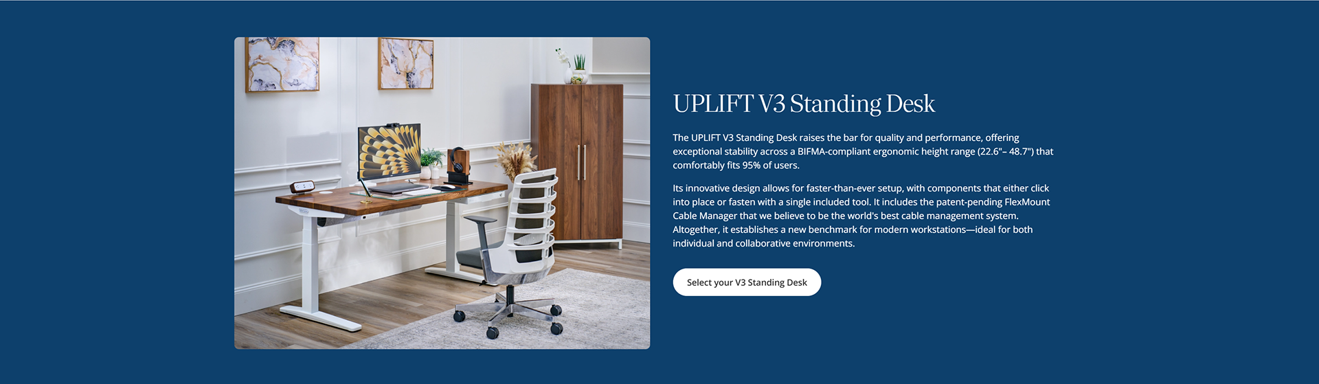
2. V3 Standing Desk Spotlighted
In the original UPLIFT Desk home page, the V3 Standing Desk was nowhere to be found. There was no product section, no product highlight or announcement. I suggested adding a product section to easily promote the V3 Standing Desk to all customers.
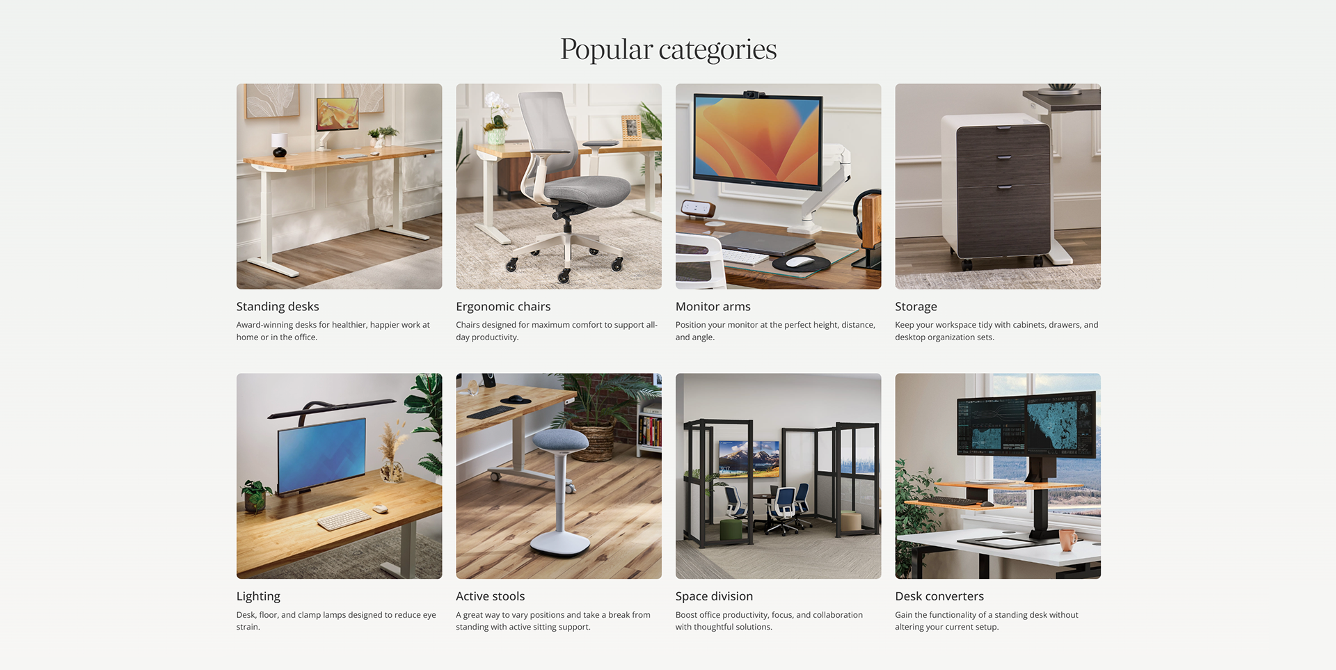
3. Categories section added
Initially, visiting customers only had three ways of surfing for products. One, manually searching through the search field. Two, using the navigation bar and three, using the home and business toggle switch found above the navigation bar. A categories section is a simple method of quickly and visually highlighting certain product categories to customers.
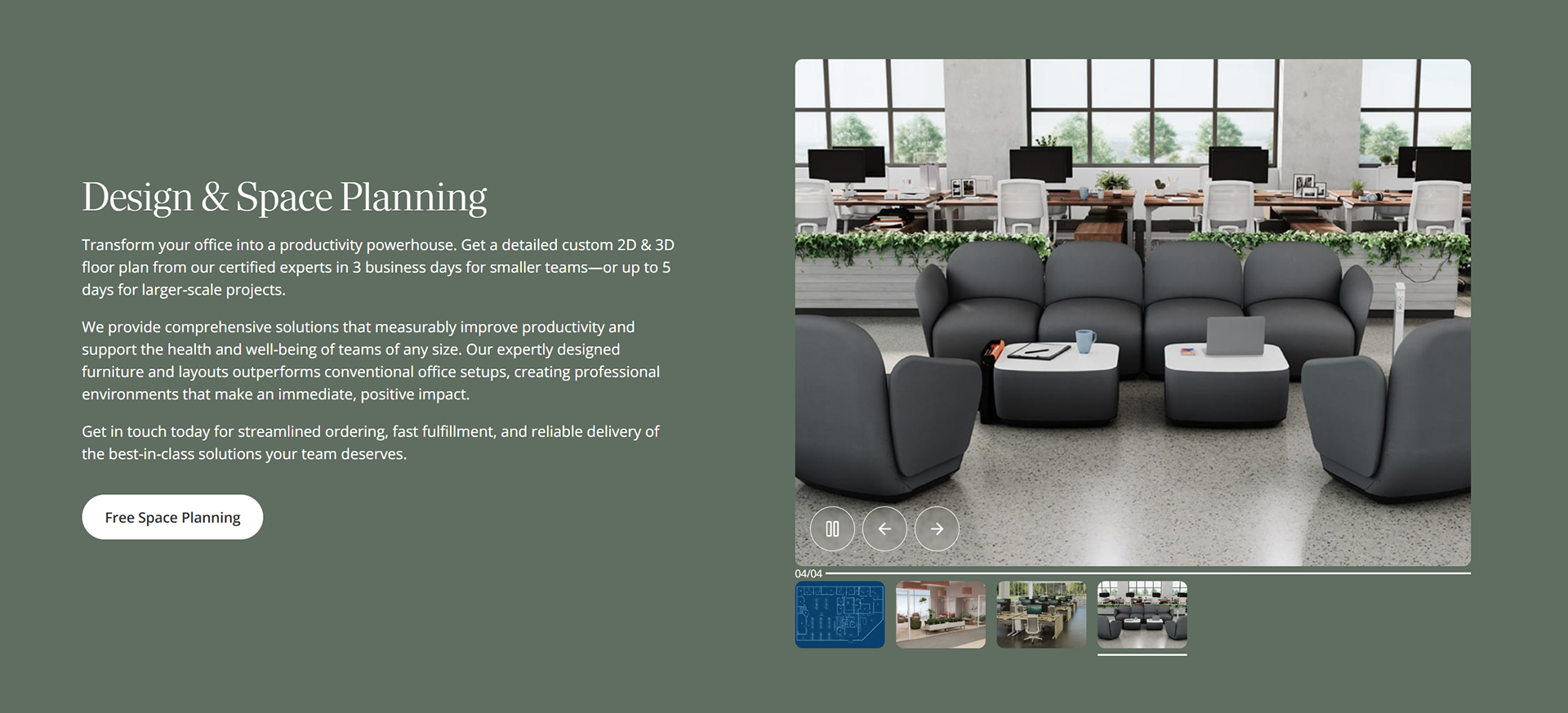
4. Design layouts reincorporated
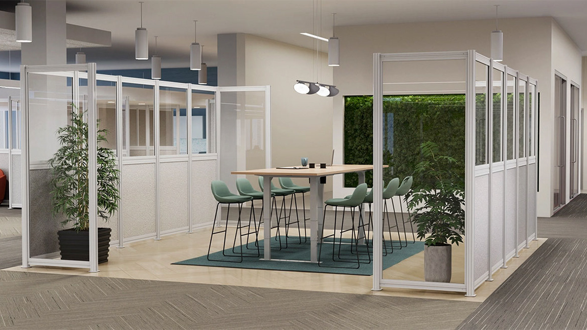
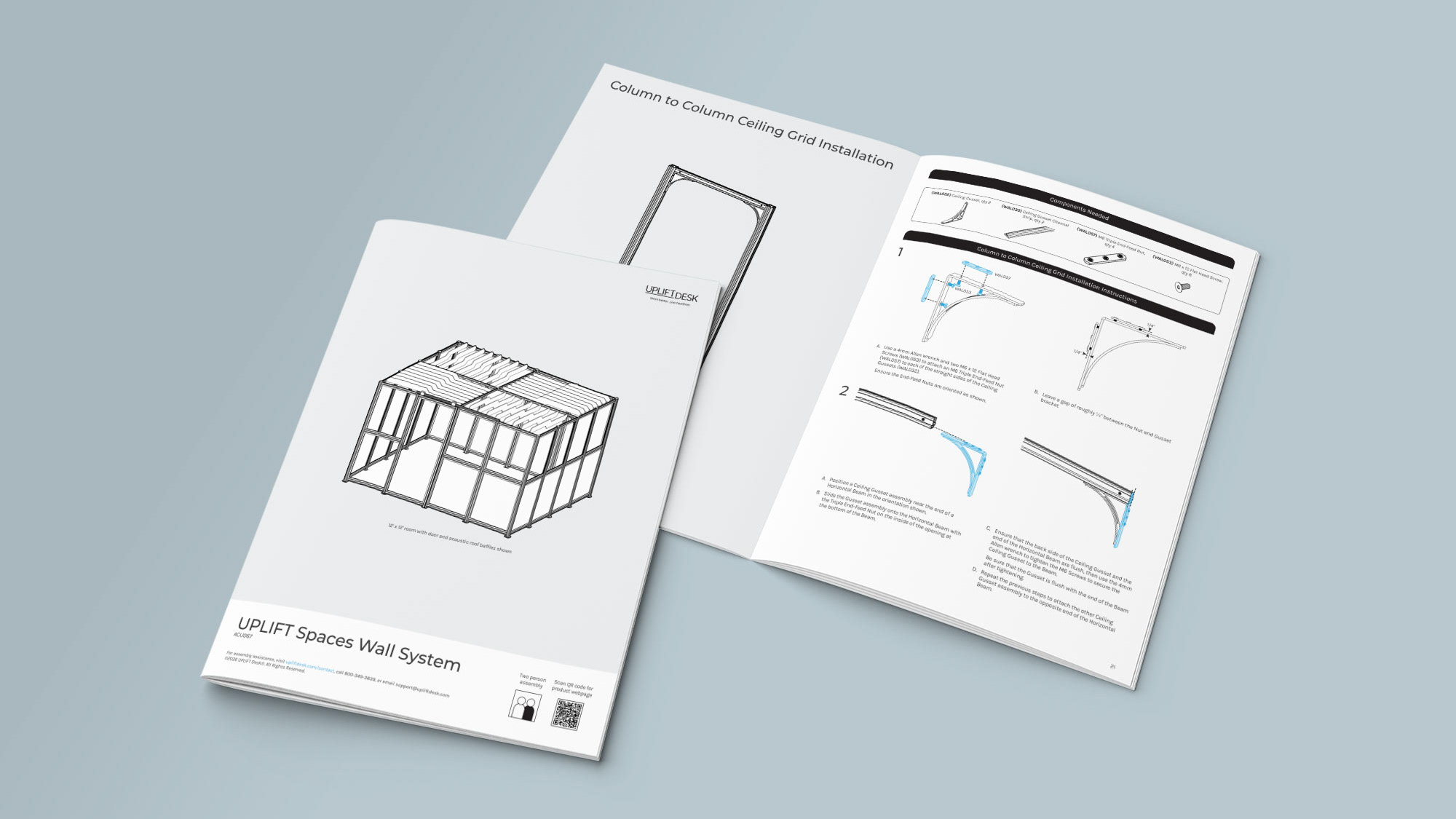
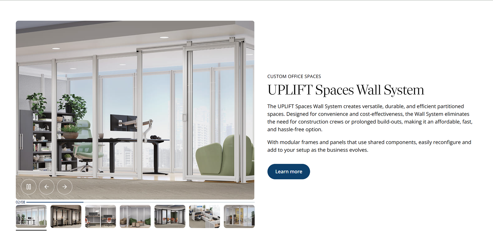
The V3 Standing Desk landing page (now taken down) had a strong design layout and interface inspired by Branch's website. I asked the marketing team to take the design from the V3 Standing Desk landing page and reuse it to promote company product, material and goals across the home page such as space planning services and less known products such as the Spaces Wall System. Below are two examples.
5. Banner toggle switch updated
Initially, UPLIFT Desk had a toggle switch on top of their navigation bar that allowed users to decide between home and business products. I recommended UPLIFT Desk to avoid using a toggle switch as a navigation system for the following reasons:
1. Double work: In order for a toggle switch to work, two separate pages, one for home and one for business products has to be built AND maintained. Not only does this cause double work and double maintenance but also double effort for customers to search and find products.
2. Findability and discoverability issues: If a customer has to decide between home and office products then naturally, they will miss out on products and sales found only on a specific page. What if a new "home office" chair is released but is not found by a fortune 500 client because it is only discoverable as a "home office" product and not as a "business" product? This turns into lost revenue.
3. Financial loss: As previously mentioned, if a product is not discoverable, difficult to find, or is not even listed for not pertaining to a specific category then businesses lose the opportunity to promote and profit from these products. This ultimately leads to lost conversions by alienating certain products and their target audience.
Navigation Toggle Switch
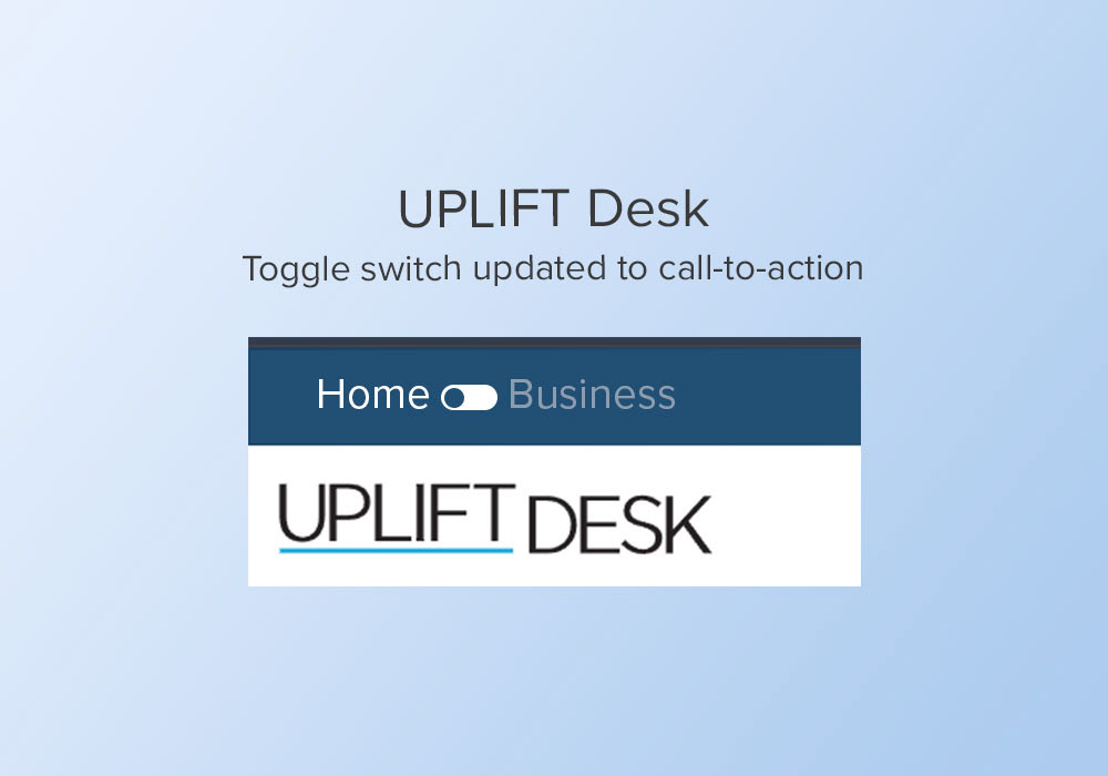
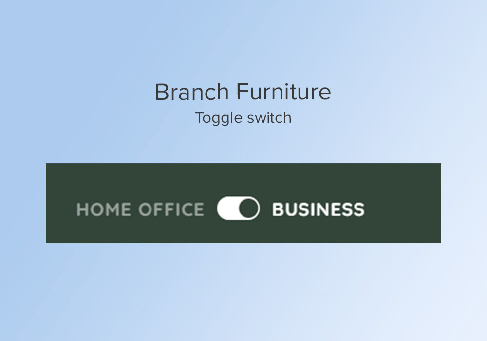
Alternative solution to a banner toggle switch
Instead of a toggle switch, I suggested UPLIFT Desk a simple call-to-action button that leads customers to a high value service with the intention of building and increasing brand/product loyalty and ultimately, conversion rates. My initial proposal was using this prominent space to take customers directly to a page where they can build an entire workspace for either home or office. Most customers come to UPLIFT Desk for their highly customizable desks, therefore it is important to add a feature that simplifies and promotes the user's journey in building a desk for their workspace. I call this feature a "full builder" and it would have features such as layout measurements, ability to add more and larger products, space planning and more. This feature would take UPLIFT Desk to a whole new business strategy level against other direct competitors. Not only would it improve sales, but it would also be a feature proof business model that allows the expandability of their services and products.
However, UPLIFT Desk chose to stay safe and decided to use this CTA button for their space planning solutions. See below.
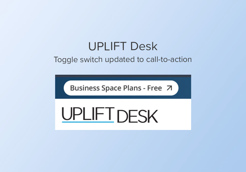

For more details on the "full builder" concept, see project "UPLIFT Desk: Desk Builder".

Product builder examples
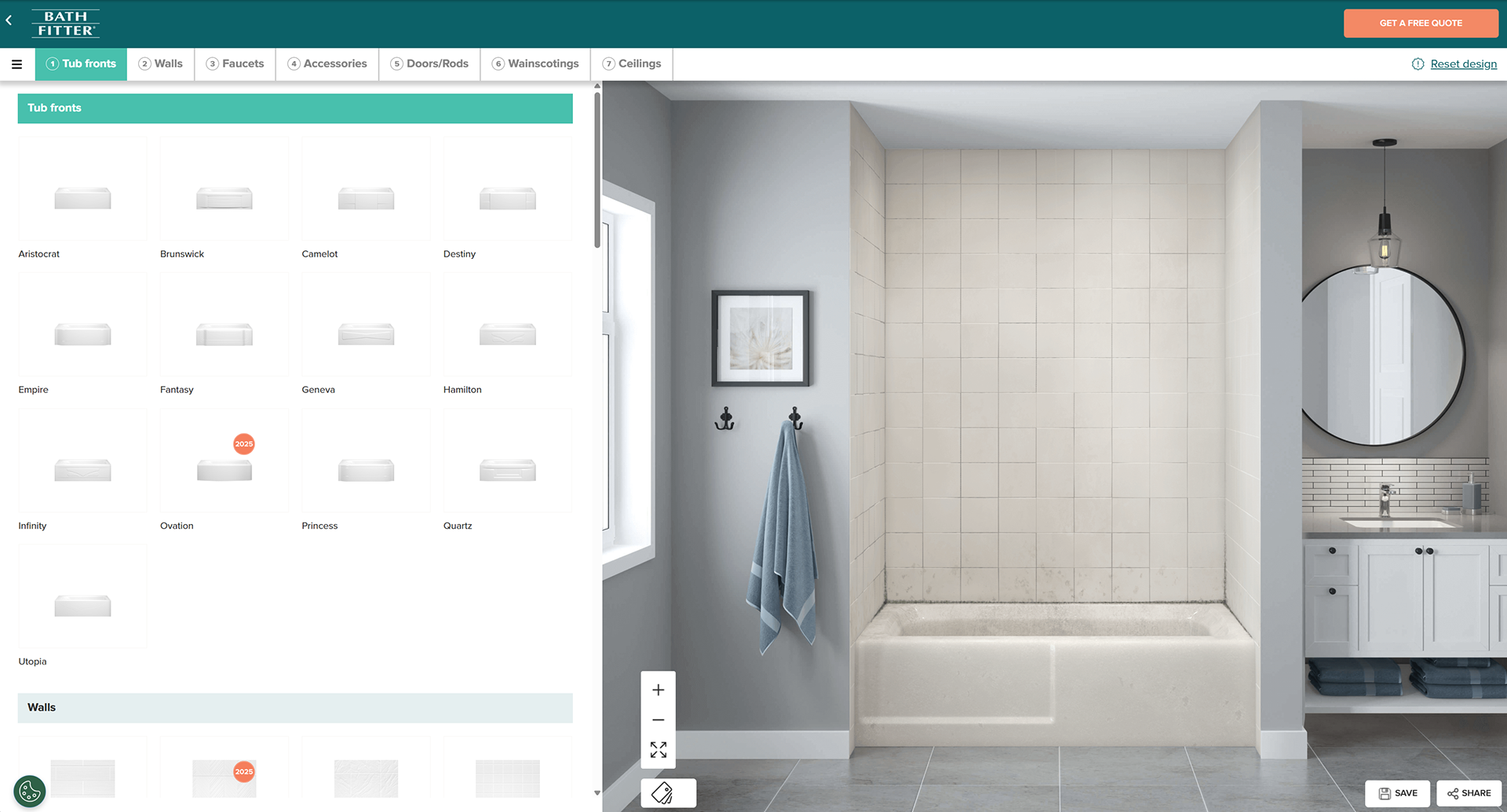
Bath Fitter
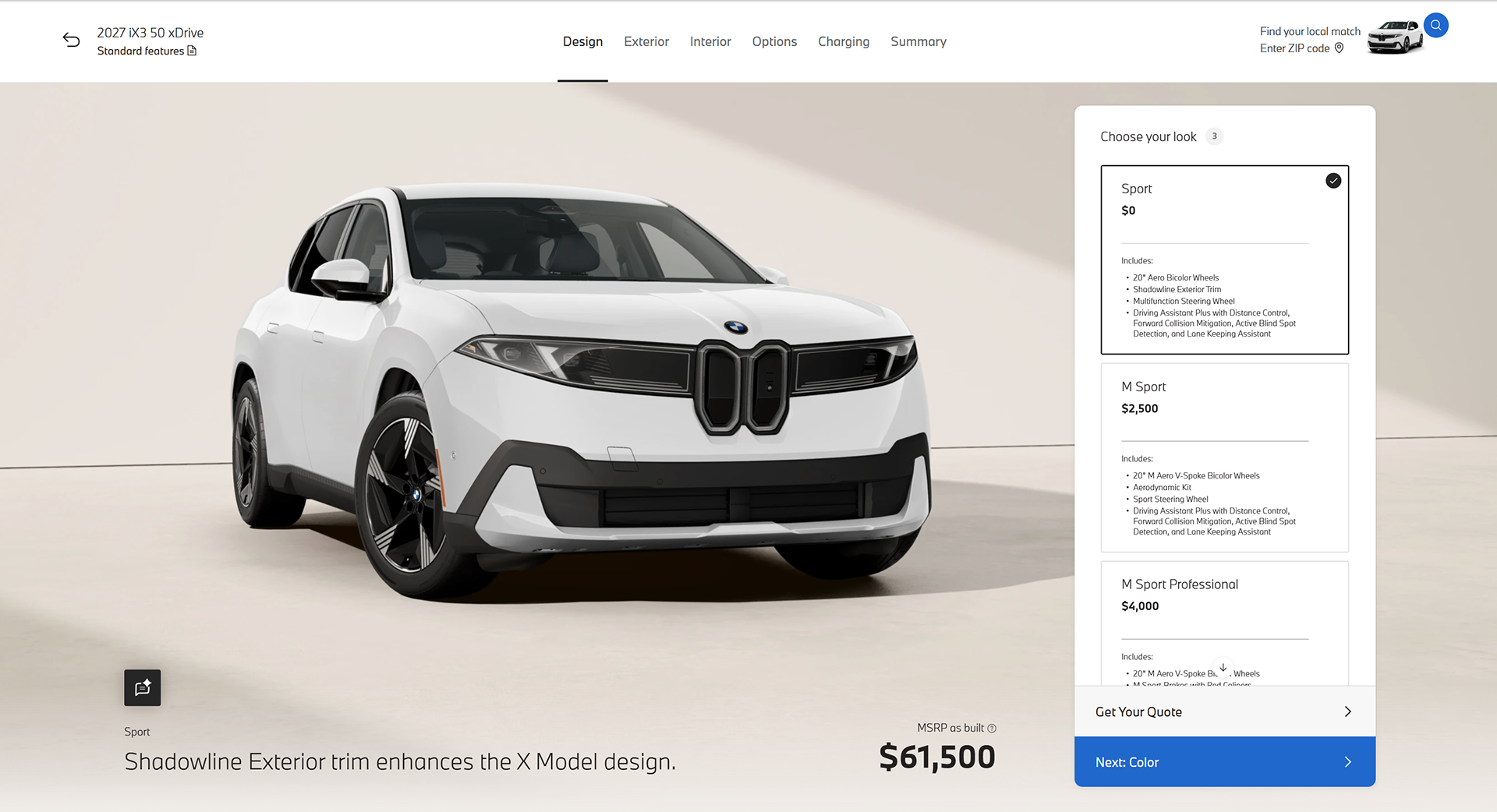
BMW
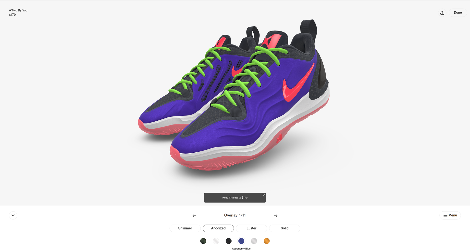
Nike
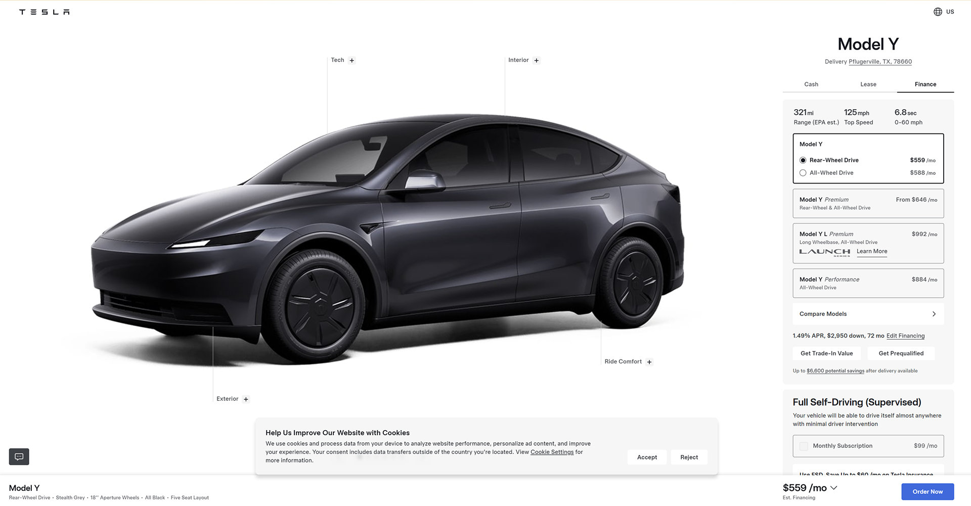
Tesla